
Demonstrating the improved PWM waveform
This post follows our prior post titled Reinventing PWM. A reader has commented to me that I hadn’t posted any test bench or other method to prove that this module works. Since I also think that such a test would be beneficial, I’ve created a test bench and demonstration which we will examine below.
Most of the parts and pieces of our test code, and certainly the methodology, could easily be applied to test just about any Digital Signal Processing (DSP) system. In short, we’ll put a test signal into the design, make some predictions about how we think that test signal will behave, and then measure the response to see how well it does and whether or not the results match our predictions.
The classic test signals for any signal processing application are sine waves and impulses. For our purposes today, we’ll focus on just the sine wave input. Specifically, let’s look at both a constant frequency and a swept frequency sine wave input, and measure the result the hardware provides. We’ll also adjust our approach for both sampling rates and volume variations.
To do this, we’ll build a test design of the form shown in Fig 1.
 |
The test-suite design will consist not only of Verilog based logic, but also a C++ test bench driver that can be used to run the Verilator based simulation. This C++ portion will be used to filter and resample the 100MHz FPGA output pin values in order to create a file which can easily be ingested and inspected within Octave.
To control this design, we’ll have the sweep and frequency control selected from a table at the top of each second over an 8-second repeating test interval. Over these 8-seconds, we’ll apply the following test cases to demonstrate the improved PWM generator:
| Second | On/Off | Test Description |
|---|---|---|
| 0-2 | ON | Swept tone from 110Hz to 27.3kHz |
| 3 | off | |
| 4-5 | ON | 440 Hz Tone |
| 6-7 | off |
We’ll also run the sine wave initially at it’s full amplitude, just to
demonstrate that there are no problems with the internal comparisons as
a function of range. We’ll later adjust to 1/256th of that amount to
demonstrate that the method works reasonably for small amplitudes as well.
We’ll use a physical switch input to select between which of the two outputs we send to a PMod AMP2 (should you happen to have one, and should you wish to try this in actual hardware).
Finally, we’ll place all the code for this test online within the wbpwmaudio repository. This will allow you to repeat the experiment, and verify the results for yourself should you wish to do so.
Test Results
Let’s walk through both the test and the results. In simulation, we’ll measure the results with a Spectrogram. (Wikipedia’s article on the Periodogram is also applicable to the time slices of the Spectrogram.) A Spectrogram is a two-dimensional image with the two axes being time and frequency. Time will go from left to right, and frequency will go from zero at the top down to the maximum at the bottom. Spectral energy comes out of the image in a third axis. You can see the Octave code for calculating the spectrogram here.
The scale on the z-axes, representing signal strength will be presented in color ranging (in decibels) from -80dB to 0dB relative to the maximum point in the image. The maximum value will be held to zero dB and colored white. We’ll artificially cut the spectrogram off at -80dB below this maximum value, and color anything at or below this level in black. Hence we should expect our tone to be a brightly colored, nearly white line, across a black (or nearly black) background. All of this minor processing code is posted here. You can even find the code defining these false colormap here.
Given the tests described above, let’s think for a moment about what we are going to expect to see from the spectrogram of the audio output. First, one would expect a slanted line, representing the initial swept tone, ranging from zero time and 110Hz frequency to three seconds and just past 27.3kHz in frequency. Further, once this swept tone reaches the Nyquist frequency associated with the underlying sample rate, whether 4kHz or 16kHz (half the sample rate), we should expect to see an “X” shape as the tone aliases back below the Nyquist limit. Second, when displaying the result of the 440Hz tone, in an ideal system we would see nothing more than a white horizontal line centered at 440Hz. Aliasing effects will appear at 440Hz plus or minus multiples of the sample rate. Third, any sudden transition will spread its energy across frequency. Hence, any transition or hiccup in the signal, such as when the transmitter starts or stops, should appear on our spectrogram as a (rough) vertical line.
We’ll run our first test with a 32kHz sample rate, and the second test with an
8kHz sample rate. The sample rate will also control the period of the
PWM
waveform. One would therefore expect silence, or near silence, to produce
a series of harmonic tones starting at this frequency when using
PWM. The
PDM system
should have no such feature. The third and final test will drop the sample
rate to 1/256th of the original sample rate. This should allow us to see
any spectral features created while the signal tries to output values near
“zero”.
These are the results that we will expect from a “perfect” system.
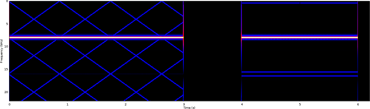
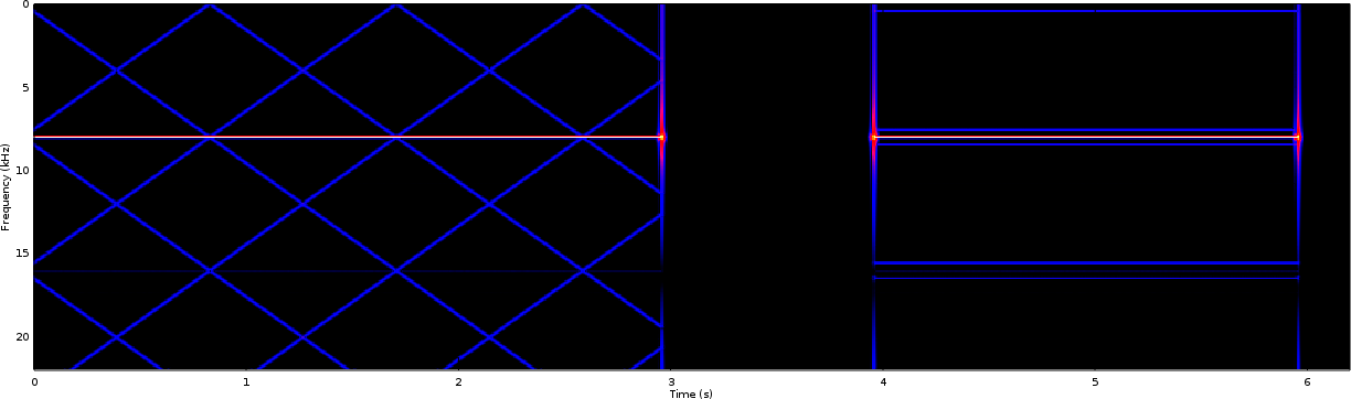
We’ll start by examining the traditional PWM result in Fig 2. In this case, the sample rate was set to 32kHz–which will also drive the period of the traditional PWM waveform generator.
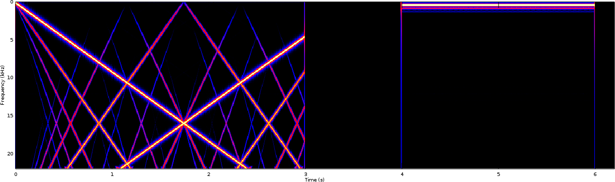 |
Because the sample interval is based about 32kHz, one would expect spectrogram content above 16kHz to be a (rough) mirror image of the content below it, and this is what we see in the spectrogram figure. Although this mirroring will continue on up to 32kHz, the image is cut off at 22kHz–the Nyquist frequency of the resampler, and the upper end of the human hearing frequency range. If you’ve never seen this mirroring effect, it can be derived from first principles under no other assumptions than the fact that the output is a sampled real valued signal rather than a complex one.
I also expect the mirror images above the Nyquist frequency to decay slowly with a rough sinc shape, due to the underlying Nearest Neighbor interpolation but I haven’t examined the results close enough to see if this is the case.
As a final item of note, the swept frequency portion of the test didn’t produce just a single swept tone line in this spectrogram, but rather a series of slanted lines. The lines appear to converge with the swept tone test signal at zero frequency and spread out from there. Put simply, the swept tone we desired to produce didn’t come out as a pure audio tone following the PWM. Instead, it producesd something still periodic but slightly different from a sine wave. These extra swept lines represent harmonics of the desired waveform, running at roughly two, three, and four times the frequency of the swept tone. (There’s even a fifth harmonic that you can see if you look close enough.) These represent undesired and unwanted distortions, caused by the PWM generator.
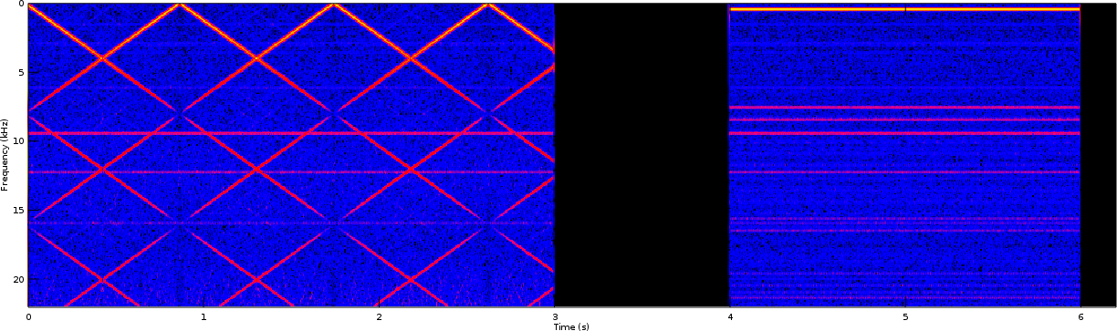
Now let’s compare that result with the PDM improved PWM) waveform in Fig 3.
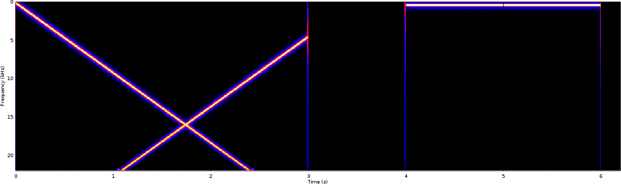 |
From here you can see that the PDM waveform roughly matches what one would expect, while the PWM waveform in Fig 2 has all kinds of harmonic distortions.
 |
If you look closely at Fig 3, you can even start to see some additional aliasing effects in the swept tone near the very bottom of the image (22kHz). Fig 4 zooms in one one of these components, so you can see what I’m talking about. These show the transition band of the anti-aliasing filter that was used within the C++ test harness. They also show the utility of having such an anti-aliasing filter in the design. Without it, there would be further swept-tone “X”s within the design, caused by the aliased components above 22kHz sweeping back into band. We’ll see these additional “X” components in the next test(s).
Let’s now repeat the above test using an 8kHz sample rate, but without providing an anti-aliasing filter for points above 4kHz.
Without this anti-aliasing filter, we should expect to see aliasing components above 4kHz instead of above 32kHz. (Remember the demo software only applies the anti-aliasing filter for frequencies above 22kHz.) You’d expect these aliasing products above 4kHz to create something where frequencies between 0-4kHz were mirrored from 4kHz to 8kHz, and then the 0-8kHz range should be repeated above 8kHz. This is what we might expect.
The traditional PWM signal, however, might also be expected to have additional distortions since the PWM interval is now within audio range. These can be seen in Fig 5. Of the tests shown, the affect appears to be the most pronounced surrounding the 440Hz tone.
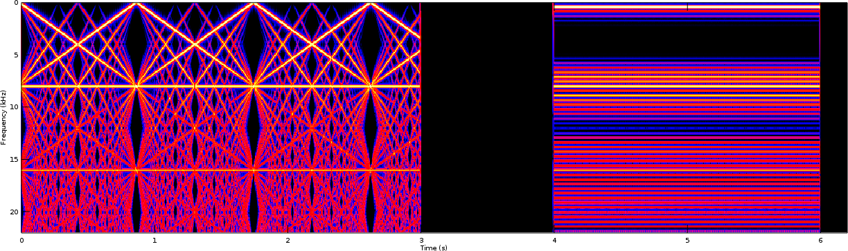 |
What’s not shown is that this result is quite unpleasant upon the ears.
The corresponding improved PDM spectrogram. is shown in Fig 6.
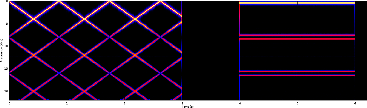 |
This spectrogram actually shows much of what you would expect: aliasing products from sampling at a rate less than 40kHz with no anti-aliasing filter. (The 40kHz number comes from twice the frequency at the top of the human hearing range.)
When comparing Fig 5 with Fig 6, the PWM output clearly has more distortion within it. Not only does it have the same harmonic distortions it had at the 32kHz sample rate, but there are also many other distortions associated with the PWM waveform interval at 8kHz. This helps to demonstrate that the improved PWM generator solves many of the problems that traditional PWM signals struggle with.
You might be surprised in Fig 5 that the traditional PWM generator did not produce an 8kHz tone during the silence period. Such an annoying tone during silence should be expected, should it not? The reason that there’s no annoying tone during this silence period is simply because the design is considered to be controlling a PMod AMP2. The AMP2 has both gain and shutdown controls, and so the simulator artificially turns the output off during those regions based upon these control outputs.
Our last comparison, then, will be focused on examining how these two
waveform generators handle very weak signals. Specifically, we’ll lower
the amplitude from full scale (or actually just nearly full scale) down to
1/256th of that amount and then repeat the 8kHz test.
The PWM output can be found in Fig 7.
 |
The improved output can be found in Fig 8.
 |
Notice the difference in the background between the two images. There you will notice that Fig 8 has a blue background instead of a black background. This is an artifact of how we have chosen to plot the signal–showing the maximum spectrogram value over the course of the test as white, and the black being defined as 80dB below that. In the case of Fig 7, you’ll notice that the PWM’s output is dominated, not by the swept tone or the 440Hz tone, but rather the PWM switching signal at 8kHz. This annoying signaling artifact sets the numeric value associated with the 0dB color (white). The improved signal has no such annoying tone setting its maximum value, and hence 80dB below its maximum value is into the quantization noise of this system, which is showing up as a blue background.
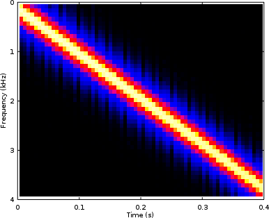
Perhaps a time slice from the 440Hz tone region would help to explain this better. We’ll remove the arbitrary image scaling, so as to show this time slice shown below in Fig 9.
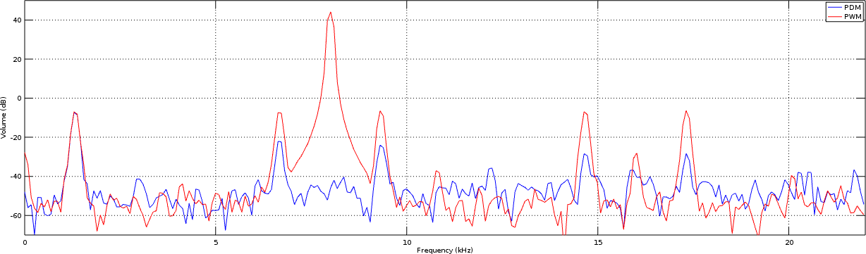 |
In this figure, you can see the PWM plotted in red, and the improved PWM signal shown in blue.
The first thing to notice is that the PWM signal has a tone in the center of it that is 40+dB higher than the signal of interest. Likewise, the background values of both are nearly identical, although the PWM implementation is showing some stronger artifacts.
Comparing the results against expectations
Now that you’ve seen the results, were they what you expected? My answer to that is somewhat.
I expected the PWM signal to have some problems, but I’ll admit I wasn’t expecting the strong harmonic distortion. While I might be tempted to believe this is caused by my test setup, the improved approach didn’t have any such distortions. Further, after reviewing the traditional PWM generation code I can’t find anything that would cause this.
I was expecting the PWM generated tone in Fig 7, though.
Some of the comments I’ve received online have suggested that the two’s complement to offset binary conversion discussed within the improved PWM article and used in the demonstration waveform generator was in error. Had this been the case, the PDM signal above would have had some seriously annoying harmonics of the desired tone as well–particulary for full-range sample values. That it does not proves that the method, and the conversions, work as stated.
Does this prove that the improved PWM generator is better? I’ll leave that to your judgment.
If you want to try this yourself
In case you want to try this test and compare the waveforms yourself, you’ll need to have both Verilator and Octave installed. On a Debian based system, such as Ubuntu, you can install these packages via:
sudo apt-get install verilator octaveOnce you have these two packages, you can download and build the demo package. Start by cloning the wbpwmaudio repository. Then change into the demo-rtl directory, and then type “make”.
git clone https://github.com/ZipCPU/wbpwmaudio.git
cd wbpwmaudio/demo-rtl
make
On a Windows system, you may need to follow the Cygwin instructions found here. (I don’t use these often, so please tell me if you struggle with them at all.)
You can then run the test (for a given switch setting) by running pdmdemo:
./pdmdemoTo view the results that
pdmdemo
creates, start up Octave
and run the script provided
on the wavfp.dbl file that
pdmdemo
generates:
> octave -q --no-gui
% showspectrogram('wavfp.dbl');
If you run this test in a separate window, while the pdmdemo is still running, you should be able to see the program’s progress as it runs through the demo.
If you want to repeat the test for the
traditional
PWM
generator, you’ll need
to edit the pdmdemo.cpp C++ file and set the traditiona_pwm boolean value in the main()
function to true. This will set the simulated hardware switch value to true.
Alternatively, you can try this design in hardware and just toggle the switch.
If you would like, you are also welcome to generate a
VCD file via the
Verilator
based simulation
as well. Should you wish to do this, you’ll want to uncomment
the tb->opentrace("pdmdemo.vcd"); line within
pdmdemo.cpp.
Be aware if you do this, though, that the
VCD file
can grow to many GB very quickly. While I’ve been successful using
VCD file,
of more than a GB, gtkwave complains when
I do so. As a result, I’ve generally tried to avoid using
VCD file,
greater than 10GB in in size. A Control-C should stop the
pdmdemo
program prior to completion if you choose to go this road.
Staring Closely
This is actually a fun opportunity to see if there’s anything to learn by staring really closely at the data.
If you’ve never used a window function before, the spectrogram code creates its results using a Hanning window. This window was responsible for the rough triangle shape of our signals as shown in Fig 9 above.
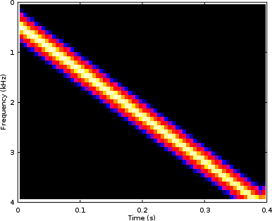
Suppose we used a better window instead?
Figure 10, below, shows the same chart as Fig 9 above, but this time with an FFT window having much better spectral resolution than the Hanning window. used above.
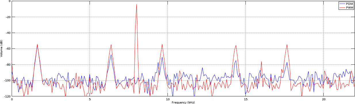 |
The biggest thing to notice is the difference in the resolution of the PWM generation found at 8kHz. Indeed, Fig 10 shows that the interference has very little spectral width to it. This is as we would expect, although not as Fig 9 above displayed. This is also a common problem found in many spectral estimation tools: the tool artificially distorts the results.
Let’s also look at the spectrogram of the PWM tone, shown in Fig 7 above, but this time using the high resolution frequency window and shown in Fig 11 below.
 |
Here you might notice the difference in line thickness of the interfering PWM tonal artifact. In Fig 11, the artifact appears much sharper and has better frequency resolution. However, this difference only follows from the individual cuts such as we showed above and its not nearly as pronounced in this view.
We could also zoom in and examine the higher power swept tone, such as was shown in the top left corner of Fig 3 above. This comparison is now shown below, with Hanning window on the left and the higher resolution window result on the right.
 |  |
| Hanning Window | Higher Resolution Window |
Should you be interested in high resolution frequency windowing, this is one of Gisselquist Technology’s commercial products.
Out of Order
Today’s test set demonstrates a lot of technology that we’ve haven’t yet had the opportunity to work through within this blog. I hope to come back and do so, and only apologize for presenting concepts out of order. Missing background topics include:
-
The test-bench for the CORDIC core generator that we’ve built.
The trick to this test bench is that the rounding and truncation taking place within the CORDIC has consequences in the output. This creates some variability in the output, variability that is a function of the parameters used when generating the CORDIC. Predicting these consequences, to know whether or not the CORDIC is producing the correct output, is taking me some work. It’s also why I haven’t posted the CORDIC test bench yet.
Sadly, the result is that this CORDIC test bench post is going to delve deeper into probability than I would like to do on this blog.
-
We haven’t really discussed how to create tone generators yet, nor have we discussed swept tone generators.
These really aren’t all that hard–especially once you have a working CORDIC. They depend upon sending an incrementing phase angle into the CORDIC module, but we can come back and discuss the topic more as we have opportunity.
-
We also haven’t discussed how to implement a downsampling filter.
This was a necessary part of the 100MHz to 44.1MHz sample rate converter within the C++ portion of today’s demonstration.
-
We haven’t discussed how to generate a good lowpass filter for a very small bandwidth signal.
The resampler within pdmdemo doesn’t really have a “good” lowpass filter within it since it is far from optimized. A better lowpass filter would have fewer taps and fewer operations.
These are all topics that we’ll need to come back and address again later on this blog as time and opportunity are available and provided the LORD is willing.
Salt is good: but if the salt have lost his savour, wherewith shall it be seasoned?